Responsive Website Design
With the increase in the use of the internet and electronic devices, the audience has shifted from desktops to mobile phones and tablets. Gone are those days when websites were designed only for large screens of laptops and desktops only. Responsive website design is the new method of designing a website that can reshape depending on the type of device. This has helped businesses to increase their targeted audience. A responsive design offers optimal user experience without the need of adjusting on mobile phones or tablets. It works on all types of devices flawlessly, offering optimal user experience.
To help you convert your old website designs to new and responsive designs or build a new website design, Zeneva tech is here to offer its services. We are industry experts with years of experience in designing responsive websites for businesses. Our expert designers understand your business requirements and design your websites according to them.
Which Is A Responsive Website Design?
You may have a question in mind how can we consider a website design to be responsive website design? Well, a responsive website design should offer three distinct features:
ConsistencyTo increase customer loyalty and build a good impression, a website design should be consistent in user experience. It should be specific and consistent in providing a better user experience. That’s what builds customers.
UsabilityWhile designing a website, the designer should not focus on overloading the website. Instead, the intent of the website design should be to provide a fast and easy-to-use experience to users. It should be fast and responsive.
Placement Of ContentWebsites are a source of knowledge and information for users about products and services. So, content is king. It should be easy to read, attractive, and useful for users. It must provide value through its engaging headlines and use of terms for the products and services.
Why Zeneva Tech For Your Website Design?
Zeneva Tech has the aim of offering fully functional and highly responsive website designs to its customers. Providing value on a limited budget is all that has helped Zenenva Tech to offer its amazing services to hundreds of clients. Some of the key features of our responsive website design are:
Four-Corner Design
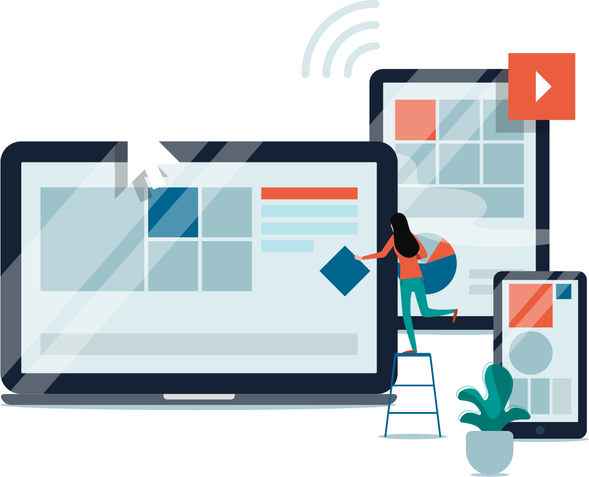
Our designers are pros in building responsive website design. Our website solutions are according to the four-corner design philosophy. So, whether your customer is using a mobile phone, a tablet, or a pc, your website will adapt to all those shapes. With our design, you won’t have to build separate websites. One design will be the solution to all your problems.Quick Response
The performance of your website is another key factor in building a strong customer base. Our website designs are designed in a way to load in milliseconds. Even heavy traffic can be easily maintained without any problem in the response rate of your website.Fluid Width
Our website designs use a specific grid-based fluid percentage that helps your website to remain intact irrespective of the size of the screen. This feature helps you to build secure and futuristic websites.Multi-Browser Enabled
Our website designs are capable of offering great response with a variety of browsers like IOS, Android, safari, chrome, Opera, Microsoft Edge, Firefox, and UC browser.Auto Shaping
All our web products show significant auto-shaping depending on the type of device which is being used. This helps your website to provide a consistent user experience.User-Centric
Our websites are designed and built according to the requirements of end users. Therefore, your website will grab the attention of your targeted customers.
Zeneva Tech is a reliable and advanced digital services provider. Let us build a responsive design for your website. We are the ones you need at the moment to secure your website from future problems.